Energy dashboards
In this post I am going to talk about energy dashboards. An energy manager has to produce tools for control and communication that help the energy team and himself to manage energy and detect deviations.
It is about having simple and useful tools. If they are visual, they facilitate understanding. The number and form of graphics to be shown will depend on the typology of the company or the energy team. You can start with a first version, improving with the contribution of the rest of the team, so that the final version will have greater acceptance and will have more quality.
To give an example, if we make the control chart of a building we could use several graphs with the absolute consumption of the different energies that the consumer has (electricity, gas, hot water, chilled water, etc). Depending on the type of consumption and the variables that affect it, it may be more convenient to represent the data in a specific value and not with absolute values. If it is the consumption of a production center, this is surely affected by the number of units manufactured. So it is much better to display the specific consumption (consumption per unit produced) since the variations will be easier to visualize.
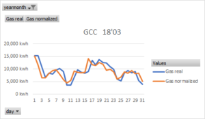
The process to generate the dashboards is as follows. First the data is processed through a filtering in search of errors (disconnections, order of magnitude, negative values, etc.). Once done we represent the real data against the theoretical. Theoretical data (dependent variable) is the result of processing the variables that influence consumption (independent variables), usually through regressions. Another way to denominate the theoretical consumption is normalized. This makes the comparison more valid because the model takes into account the oscillation of the independent variables.
In a next article I will talk about how data should be discriminated when the patterns of consumption are different for some data groups (weekends, working days, working and non-working hours, etc.).
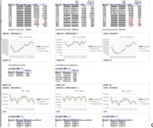
When representing, we can use the following information:
– real and normalized consumption.
– detailed consumption of each energy (gas, electricity, etc.).
– monthly consumption of the year and daily of the last month.
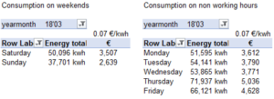
– summary of consumption on weekends and non-working hours.
– absolute or specific consumption.
Dashboards help us control consumption and detect deviations, opportunities or measure project savings. To control the savings it is very useful to use cusum graphics. These graphs represent the cumulative difference between the real energy and the baseline. The baseline is a representative period of time prior to the saving action. We may need to normalize them if it depends on variables that oscillate before and after the saving action.
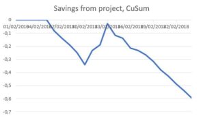
Depicting the accumulated is very useful when savings are small compared to the total consumption measured. In this case they can not be seen properly in a normal graph. But in a cusum they are recognizable.
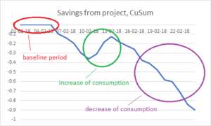
We can detect increases or decreases in consumption, which allows us to focus on what happened at those moments. In the previous example, if the slope is negative we are saving but if it is positive we are consuming more than the baseline. Thus, we have to investigate what happened. You can check my post on how to correctly measure energy savings.
The energy control panels are a communication tool to be used by the energy team. They help us to establish the magnitude and the moment of a deviation in consumption.
It is advisable to have a general panel with the total energy consumed by the company and also have a group of panels for each representative consumer center (buildings, production lines, etc.).
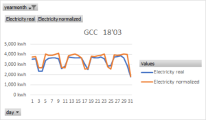
Theoretical models or normalization allows to compare the real data in a more correct way. I usually calculate them using multilinear regressions (more than one dependent variable). Over time the models are refined, gaining in accuracy. I make a model for each energy: electricity, gas, hot water, water coolant, etc. Then I compare them with the real ones. I confront the last 12 months to have all seasonal periods. And I also control the last month with the daily data. I have charts and tables to study the working and non-working hours, and the working days and the weekends.
